Google’s Iconic ‘G’ Logo Just Got a Glow-Up After 10 Years
Date: May 13, 2025
Google’s new 'G' logo swaps solid colors for gradients, hinting at a broader visual shift tied to its AI ambitions.
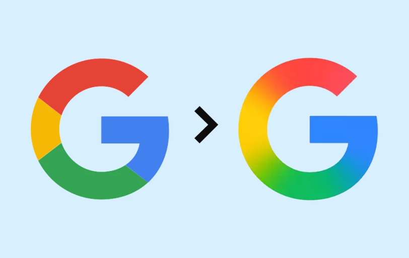
It’s not every day that Google tweaks one of its most recognizable symbols. But after nearly a decade of sticking with the same colorful badge, the tech giant has quietly rolled out a fresh take on its signature "G" logo — and it’s all about gradients.
Gone is the flat, solid-color design introduced back in 2015. In its place: a more fluid, ombré version of the familiar red, yellow, green, and blue swirl. If you blink, you might miss it — but zoom in, and the new aesthetic feels cleaner, softer, and unmistakably modern.
From Flat to Flowing
The updated logo first appeared in the iOS version of the Google Search app, and it's now making its way to Android beta users (version 16.18, to be exact). While most users probably wont notice much at first sight, the change is a reflection of the broder shit in the google design language — one increasingly shaped by AI.
The new gradient G echoes the visual styling of Gemini, Google’s generative AI assistant, which uses a similar blue-to-purple fade. It’s a subtle but clear signal: Google is rebranding for the AI age.
Same Letter, New Look
To be clear, this isn’t a total logo overhaul. The “G” keeps its familiar shape, first introduced in 2015 when Google adopted a friendlier, sans-serif typeface. What’s changed is the texture — now smoother, more dimensional, and perhaps more expressive of where the company is headed.
As of now, only iOS users and owners of Google Pixel devices are seeing the new logo by default. Other Android users and desktop web users will have to wait a little longer for the gradient to show up. No word yet on whether other Google product logos (like Gmail, Maps, or Chrome) are getting the same treatment, though it wouldn’t be a surprise.
Reactions: Shrugs, Sarcasm, and Speculation
Online, reactions have been mixed. Some users barely noticed the difference. Others poked fun at how little actually changed. Still, design folks and brand watchers see it as more than just a cosmetic update — it’s a branding breadcrumb leading to a more AI-centric Google experience.
No official statement from Google has clarified the broader intent behind the redesign, but the timing — just ahead of I/O 2025 — suggests this is more than a quiet polish. It’s a step toward a more cohesive visual identity that ties together everything from search to smart assistants.
And if you're wondering why your app icon suddenly looks a little softer — now you know.

By Arpit Dubey
Arpit is a dreamer, wanderer, and tech nerd who loves to jot down tech musings and updates. With a knack for crafting compelling narratives, Arpit has a sharp specialization in everything: from Predictive Analytics to Game Development, along with artificial intelligence (AI), Cloud Computing, IoT, and let’s not forget SaaS, healthcare, and more. Arpit crafts content that’s as strategic as it is compelling. With a Logician's mind, he is always chasing sunrises and tech advancements while secretly preparing for the robot uprising.
// Recommended
Pinterest Follows Amazon in Layoffs Trend, Shares Fall by 9%
AI-driven restructuring fuels Pinterest layoffs, mirroring Amazon’s strategy, as investors react sharply and question short-term growth and advertising momentum.

Clawdbot Rebrands to "Moltbot" After Anthropic Trademark Pressure: The Viral AI Agent That’s Selling Mac Minis
Clawdbot is now Moltbot. The open-source AI agent was renamed after Anthropic cited trademark concerns regarding its similarity to their Claude models.

Amazon Bungles 'Project Dawn' Layoff Launch With Premature Internal Email Leak
"Project Dawn" leaks trigger widespread panic as an accidental email leaves thousands of Amazon employees bracing for a corporate cull.

OpenAI Launches Prism, an AI-Native Workspace to Shake Up Scientific Research
Prism transforms the scientific workflow by automating LaTeX, citing literature, and turning raw research into publication-ready papers with GPT-5.2 precision.

Have newsworthy information in tech we can share with our community?
Related Content