
- What’s Driving Website Design Trends?
- Website Design Trends That Will Matter in 2026
- Adaptive and Context-Aware Interfaces
- Bento Grid Layouts (Modular Clarity)
- 3D and Immersive Elements (Beyond the Flat Screen)
- Gamified Design (Building Interaction Loops)
- Embedded Videos For Engaging Homepages (Silent Storytelling)
- Bold Typography & Kinetic Text (Words in Motion)
- Dopamine Colors (Vibrant Optimism)
- Micro-Interactions & "Emotional" Feedback
- Accessibility-First "Multimodal" Design
- Monochromatic Websites (With a High-Contrast Edge)
- Kinetic Typography (Text in Motion)
- Spatial UI & "Glassmorphism 2.0"
- Web Design Trends That Are Losing Relevance
- Final Thoughts
 Share It On:
Web design is no longer just about how a site looks when the page loads—it’s about how it handles the "vibe" after the first click. We’ve moved past the era of generic templates. In 2026, digital experiences are defined by speed, inclusivity, and personalization.
The current web design trends aren't just about chasing aesthetics; they’re a direct response to massive shifts in how we use the internet—from voice-first browsing to AI-driven search overviews. If your site doesn't play nice with these new behaviors, it’s basically invisible to both humans and bots.
What’s Driving Website Design Trends?
Why do sites look so different now? It’s not just a mood; it’s a necessity born from a changing tech landscape.
1. The Rise of "Agentic" User Behavior
Users aren't just clicking anymore; they're interacting with AI agents that "read" your site for them. This shift toward AI in web design means your site needs to be structured for both human eyes and machine reasoning. If an AI can't summarize your value prop in three seconds, you're toast.
2. Regulatory Pressure and Accessibility Laws
With the European Accessibility Act (EAA) and similar global mandates in full swing, accessibility has shifted from a "nice-to-have" to a legal requirement. Web development companies are now building inclusive design into the foundation to avoid heavy fines and, more importantly, to reach the 20% of users with disabilities.
3. The "Zero-Wait" Expectation (INP)
Google’s shift to Interaction to Next Paint (INP) as a Core Web Vital has changed the game. It’s no longer just about how fast the page loads, but how fast it responds when you click. This is driving modern website design trends toward ultra-lightweight code and "performance-first" creativity.
4. Multi-Device and Ambient Browsing
From foldable phones to AR glasses, the "standard desktop" view is officially a minority. Responsive web design trends now prioritize "ambient" layouts that can stretch, shrink, or even simplify themselves depending on the hardware.
5. Sustainability and "Green" UX
The internet has a carbon footprint, and users are starting to care. Latest web design trends include using system fonts, optimized SVGs, and darker color palettes (to save OLED battery) as a way to signal brand ethics while boosting speed.
Website Design Trends That Will Matter in 2026
1. Adaptive and Context-Aware Interfaces
We’re moving away from "one-size-fits-all" layouts. In 2026, the most effective modern website design is one that changes based on user intent. If a user is browsing your SaaS site for the fifth time, they shouldn't see the "What is SaaS?" hero section; they should see a "Welcome back, here’s your dashboard" shortcut.
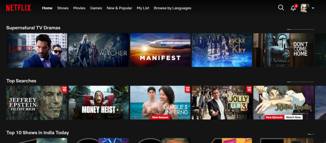
- Real-world example: Netflix is the gold standard here. Their UI doesn't just suggest shows; it dynamically changes the artwork of the thumbnails to match your aesthetic preferences (action-packed scenes for thriller fans vs. soft palettes for romance lovers).
2. Bento Grid Layouts (Modular Clarity)
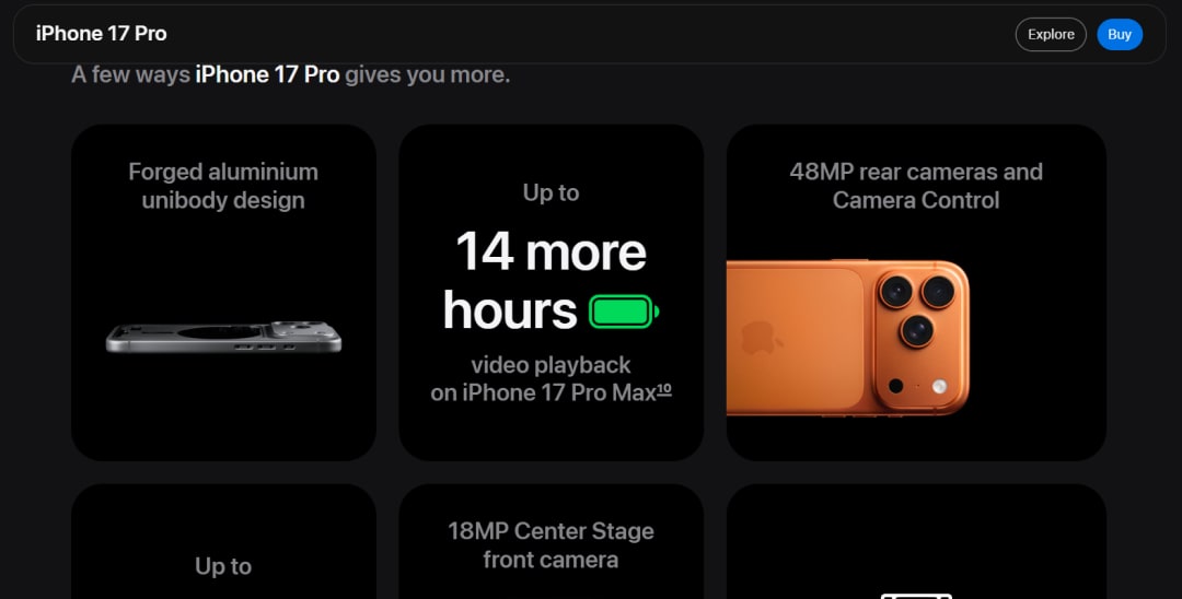
If you’ve noticed everything looking like a neat Japanese lunch box lately, you’re seeing the "Bento Grid" trend in full force. It’s the ultimate way to handle information density without looking like a cluttered 1990s Craigslist page. Bento Grids have a distinct, rounded rectangular tiles that organize different types of content (stats, images, and text) into a single, cohesive view.
- Real-world example: Apple uses Bento Grids for almost all their product launch pages (like the MacBook and iPhone 16/17 series) to display technical specs in a way that feels premium and easy to scan.
3. 3D and Immersive Elements (Beyond the Flat Screen)
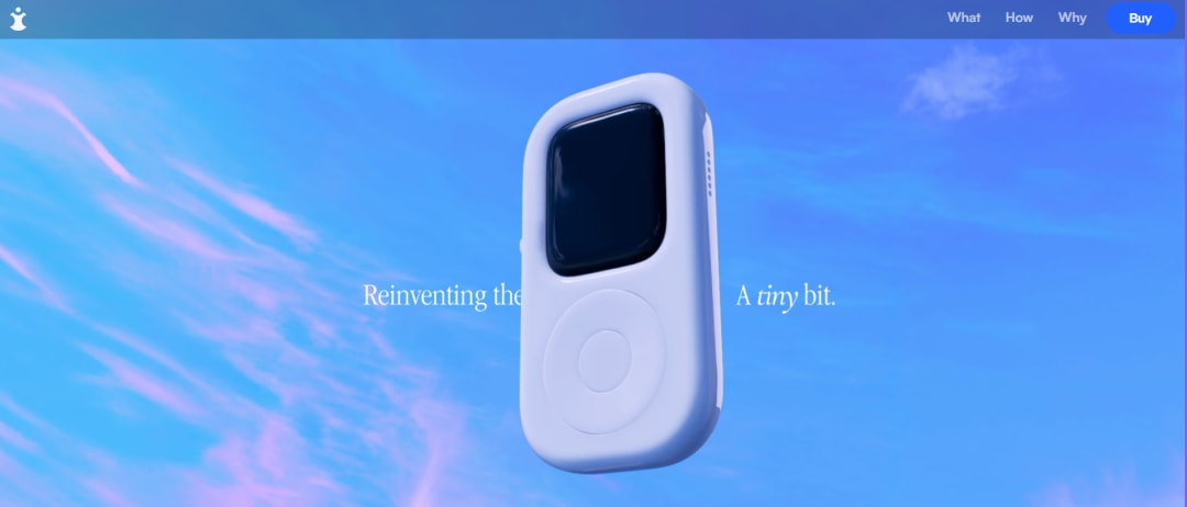
Interactive 3D has moved from being a performance hog to a conversion driver. With the maturity of WebGL and Spline, top website designs now include "touchable" depth that doesn't tank your load times. These elements tilt with cursor movement or 3D product models that users can rotate to inspect every detail.
- Real-world example: tinyPod uses 3D rotations to explain hardware, while Solar Journey allows users to explore the cosmos through interactive planetary models directly in the browser.
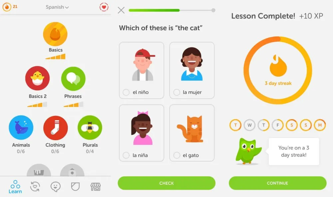
4. Gamified Design (Building Interaction Loops)
Engagement is hard, but gamification makes it addictive. Trends in web design for 2026 Gamified designs that triggers a dopamine hit that keeps users coming back. The method of design can be used for progress trackers, achievement badges, and interactive challenges that turn a boring task into a "win."
- Real-world example: Duolingo is the king of streaks, but even enterprise tools like Toggl have experimented with mini-games and neubrutalist elements to keep users engaged with time-tracking tasks.

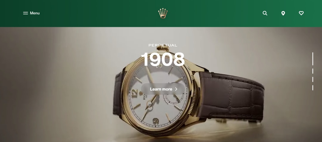
5. Embedded Videos For Engaging Homepages (Silent Storytelling)
Static hero images feel like a relic the moment a competitor launches with motion. Background videos communicate brand personality in seconds. These must be silent, looped, and highly optimized (under 10MB) to pass modern website design performance tests.
- Real-world example: Rolex uses sweeping close-up shots of watch movements to signal quality, while Noah Demeuldre uses reveal scroll effects on his video portfolio to keep the experience captivating.
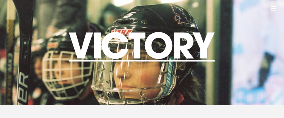
6. Bold Typography & Kinetic Text (Words in Motion)
Now, text isn't just for reading—it is the graphic element. We’re talking massive, "absurd" fonts that stretch or pulse as you scroll. It’s lightweight and commands attention without needing heavy imagery.
- Real-world example: Eventbrite recently rebranded with a bouncy, expressive serif that feels alive, and Victory Journal uses supersized typography to anchor its editorial content.
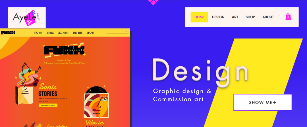
7. Dopamine Colors (Vibrant Optimism)
"Dopamine colors"—vibrant neons and hyper-saturated hues—rebound against sterile minimalism to trigger literal hits of happiness. These palettes communicate confidence and energy, making a site instantly memorable.
- Real-world example: Ayelet and Spotify Wrapped utilize these zesty gradients to energize their UI and guide users toward critical engagement points.
8. Micro-Interactions & "Emotional" Feedback
This is what separates the "cheap" sites from the "luxury" ones. Micro-interactions are those tiny animations that happen when you perform an action—like a heart that pops or a progress bar that has a satisfying "pulse."The main goal is to provide instant reassurance that the website "heard" you. It reduces uncertainty and makes the digital experience feel more human.
- Real-world example: Airbnb uses these flawlessly. When you "heart" a listing, the icon doesn't just change color; it has a subtle, tactile pop. Their search transitions also move you through dates and guest counts with zero jarring jumps.
9. Accessibility-First "Multimodal" Design
In 2026, accessibility is a legal baseline. Responsive web design trends now focus on "multimodal" interaction (letting users talk, type, or gesture to get things done). This trend focuses on interfaces that switch modes automatically. For instance, a site might switch to voice-only mode if it detects you’re driving or handling objects.
- Real-world example: Microsoft Teams and Apple’s Live Captions settings show how "high-contrast" and "live text" can be built into a polished interface without making it look "ugly" or institutional.
10. Monochromatic Websites (With a High-Contrast Edge)
Sometimes, the loudest way to stand out is to use less color. Single-color layouts create a sharp, performance-optimized visual consistency that screams "luxury." In this trend, designer use varying tones of one color (like all blues) and one high-contrast "pop" for the primary Call to Action (CTA).
- Real-world example: Online insurance solution Lemonade uses its signature pink as a monochromatic base to keep the user focused on the application flow.
11. Kinetic Typography (Text in Motion)
Static headers are a vibe killer in 2026. Latest web design trends show that big, bold text can do the work of a 50MB video file if it’s animated correctly. Kinetic type reacts to your scroll, your mouse movements, or even the music playing on the site. The primary benefit of Kinetic Typography is that It’s lightweight and keeps the user’s eyes glued to your main message.
- Real-world example: Spotify Wrapped is a masterclass in this. They use "Kinetic Celebration" where fonts stretch, explode, and pulse to match the data being shown, turning a simple stat into an emotional moment.
12. Spatial UI & "Glassmorphism 2.0"
With the rise of products like the Apple Vision Pro, UI design trends are becoming more "spatial." We’re seeing a return of depth through frosted glass textures, soft shadows, and translucent layers. It’s no longer just about looking "glassy"—it’s about using translucency to show the user exactly where they are in the site's architecture.
Web Design Trends That Are Losing Relevance
If you're still doing these, it's a bit of a "cringe" moment for your brand. Here’s what’s straight-up outdated:
1. Heavy Parallax Scrollers
These used to be the "wow" factor, but in 2026, they're just a vibe killer. They tank your performance scores and make mobile users dizzy. Top web design firms have swapped these for more intentional, scroll-triggered animations.
2. "Mystery Meat" Navigation
Hiding your menu behind three dots or a cryptic icon is a UX sin. If I have to play detective to find your pricing page, I'm bouncing. Navigation should be thumb-friendly and obvious.
3. Generic AI Art and Sterile Minimalism
The "corporate Memphis" look and generic AI-generated humans are officially stale. Users are craving "grit" and authenticity. Sites that feel too perfect or "empty showroom" sterile are being ignored in favor of hand-drawn elements or real photography.
4. Intrusive Pop-ups and Overlays
Nothing kills a conversion faster than three pop-ups before the page even loads. Current website design trends favor "contextual" CTAs that appear only when the user shows intent, rather than a blanket "sign up for our newsletter" blast.
5. Non-Responsive Desktop-First Layouts
Designing for desktop and "shrinking" it for mobile is backwards thinking. If your site doesn't feel like a native app on a phone, you're missing out on the 70%+ of traffic that lives on mobile.
Final Thoughts
Designing for today is now a lot more than being the "loudest" site in the room. Being the most helpful site is the way to go. The latest website design trends show that the winners are the ones who prioritize the user’s time and needs over their own ego.
Ready to give your site a glow-up? It might be time to stop thinking about your website as a static page and start viewing it as a living, breathing part of your team.
- Real-world example: Stripe and Linear use "Liquid Glass" sidebars and modal windows that allow the background colors to bleed through, creating a sense of physical layering and high-end focus.
Frequently Asked Questions
What are the largest web design trends by 2026?
What is the effect of AI on web design?
Are WordPress web design trends worth investing by the businesses?

Uncover executable insights, extensive research, and expert opinions in one place.


