Date: April 05, 2024
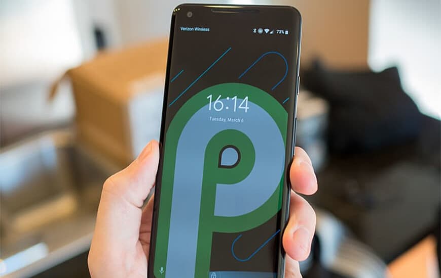
Google finally pulled off the curtain from its next major Android update by enrolling the developer preview of Android P. As the developer preview 1 is now available it shows how the company is bringing major visual changes to the OS.
The rumors about Google working on the next Android version have been going for a long time now. However, the company released the first look of the next version a bit earlier than everyone had expected.
The developer preview comes with some changes to the home screen and tweaks to the interface. As this is just an early build of the final product, so things may change when the fully developed Android P comes out. But, the preview is enough for you to know that Google is planning to give a huge makeover to Android.
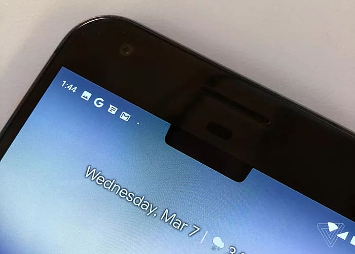
1. The very first change we have noticed with the Android P developer preview is the replacement of the clock for making space for the notches or 'cutout display support'. Google has shifted the clock from the right corner to the left corner of the status bar. Along with this, the notifications are right beside the clock along with a dot representing more notifications in the queue.

2. Continuing its habit of making changes in the Settings menu, Google made it more colorful in the preview. In addition, the setting options like Network, Connected Devices, and Display receives new icons.

3. The Quick settings panel is also in the transition, as the company has rounded its edges. The quick settings icons like WIfi and Battery are now enclosed in a circle with blue color and switches to grey when disabled.

4. The Dock has been settled at the bottom of the Android P’s screen with the user’s favorite app and a white dot to access voice note or Google Assistant. The Dock also includes a Google search bar and has a cloudy background separating it from the rest of the home screen.

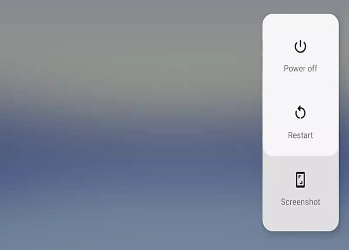
5. In Android, P Google makes it easy to take a screenshot. The company added the screenshot option to the Power button.

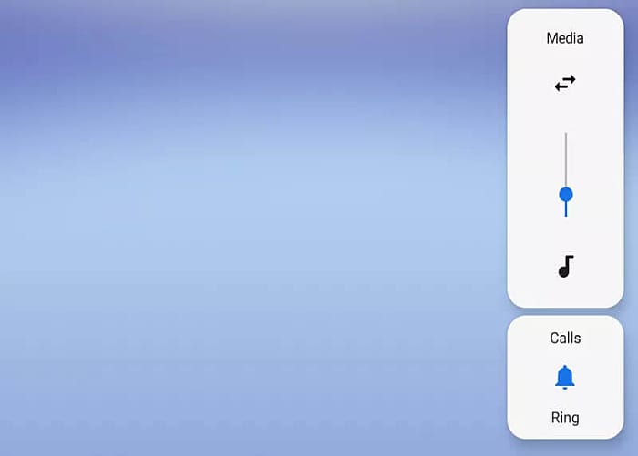
6. The volume slider has been also rearranged by the Android maker in the developer preview. The slider has moved to the right side of the screen, to switch between ring, silent ringer and vibration mode you need to tap the bell icon.

7. While browsing through the different options, one thing that captured our attention was the change in the font style of Android. The font used by Google for the Pixel’s branding named Product Sans is present throughout the system.

This is all that we were able to extract from the first developer preview of the Android P. The second release for the preview is expected to come at the Google I/O Developer Conference 2018.
ChatGPT Saves $5000 In Wedding Planning For The Brides Of New York
AI-savvy brides of New York are utilizing the powerful LLMs of ChatGPT to plan their weddings and are saving up to $5,000 on the way.

Apple Launches OpenELM, That Outperforms Public OLMOs
Apple recently changed its stance of being a closed technology company by releasing an Open-Efficient Language Model that offers 2x accuracy.

WhatsApp Is Working On An In-App Dialer Feature
WhatsApp may soon introduce an in-app dialer to allow its users to call directly from the app using Wifi or cellular data.

X Will Soon Launch A TV App For Video Streaming
Elon Musk’s parent company of famous social media platform, X, is planning to launch an exclusive TV app for streaming videos.

