#News

Android New Logo Is Now 3D, More Human, and Seriously Fun

Android New Logo Is Now 3D, More Human, and Seriously Fun

Date: September 06, 2023

While the world eagerly awaits the latest Android 15 release, Android has surprised everyone with a refreshed branding in its name and logo.

Android, as of today, has nearly 3 Billion users worldwide. But not everyone would remember the anticipation it used to create with every Android version update. Once upon a time, on our Android phones, we used to have cool names like Android Lollipop as an update, which later changed to simpler versions of Android 13, 14, and so on. And now, Android has revamped its logo completely, leaving the entire global Android community surprised and excited at the same time.

What’s New?

Android explained the reason behind this entire rebranding, stating that its Logo should reflect the core ethos of being open, iterative, and inclusive. The new visual identity represents the Android community and is quite fun too. The Android team believes that today’s people want more choice and autonomy, and the brand wants to reflect their vision of offering the freedom to create on their terms.

The new Android Name Starts With A

After years of keeping the first letter of its name in smallcase, the brand has finally decided to make the first letter capital, and there’s an interesting reason behind it as well. 

We’re elevating the Android logo by capitalizing the “A,” adding more weight to its appearance when placed next to Google’s logo. While we’ve added more curves and personality unique to Android, the new Android stylization more closely mirrors Google’s logo and creates a balance between the two.

- Google

The new stylization makes the Android look identical to Google, starting with a capital ‘G’ to better communicate the relationship between Android devices and the Google apps & services to its consumers. 

The Refreshing New Logo

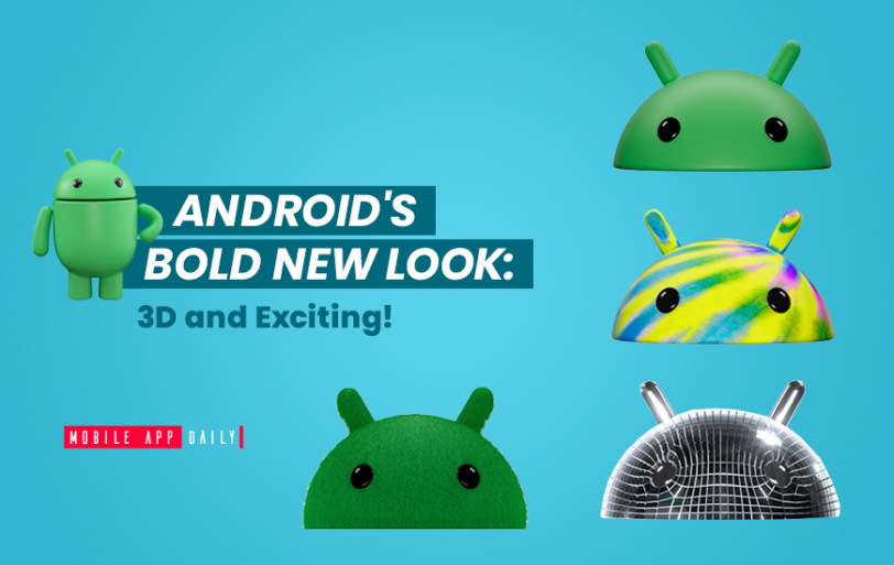
In the last decade, Android has implemented multiple changes to modernize its services and evolve to the changing needs of its community. They first simplified the new version release names from ‘Android KitKat’ to ‘Android 14’ to make it more understandable globally. As part of this vision, the Android robot named ‘Bugdroid’ has become a prominent fixture of the logo. The latest rebranding showcases the same robot in a much more interesting way and also in 3D. Take a 3D look for yourself.

The new Bugdroid also has a full-body version, which is predicted to be useful for the next Android 15 release. The new Android version will add AI to most of its services, and AI usually has a representation model along with it, in which the full-bodied bugdroid perfectly fits.

We've also updated the robot’s full-body appearance to ensure it can easily transition between digital and real-life environments, making it a versatile and reliable companion across channels, platforms, and contexts.

- Google

We will soon see these changes in the name and logo across all channels, platforms, and mobile devices starting this year.

Arpit Dubey

By Arpit Dubey LinkedIn Icon

Arpit is a dreamer, wanderer, and a tech nerd who loves to jot down tech musings and updates. With a logician mind, he is always chasing sunrises and tech advancements while secretly preparing for the robot uprising.

Have newsworthy information in tech we can share with our community?

Post Project Image

Fill in the details, and our team will get back to you soon.

Contact Information
+ =